We will be introducing a technique for LP (Landing Page) that will dramatically increase conversion rates and ensure higher sales for your e-commerce site.
- Place a web ad
- Transition to LP
- Purchase products
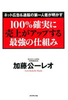
The following is a technique that leads from (1) to (2) to (3) to (4) to (5). These 7 LP techniques were introduced in the book "The Strongest Mechanism to Increase Sales 100% Certainly," and were also introduced in a YouTube video by Manabu-san, who runs Manablog.
Although it has been a little while since the book was published, I found many parts of the book helpful in creating LPs, so I will summarize them here.
The basic premise of creating an LP that generates sales
First, let me say the basic premise of web advertising
Most web ads are ignored.
The reason for this is that The click rate for the typical online ads in this book is around 0.1%, and only a handful of them really make it to the point of purchase.
And to increase that click rate first, this book recommends the following
- One-Step Marketing and Two-Step Marketing
→Two-step marketing is recommended, in which potential customers are not directly led to purchase the product, but are led to the sale of the product after being attracted by monitors and samples.
Directly from web ads to LPs, not directly to products
→Do not send customers directly from web ads to product pages or the top page of the website. Always direct the customer to the LP that matches the advertisement.
We felt that the above may be effective depending on the product and industry, so we will move on to LP techniques after applying the above.
Technique #1: The first view must include a catch copy, photo, and application icon.
Data shows that people who click on a web ad decide whether to continue reading the site within 8 seconds.
In such a situation, the first view is just a photo of the product. In such a situation, an LP with only a photo of products on the first view will lose half of its effectiveness. This book recommends that you should grab the customer's heart with photos and catch copy, and also place an application icon so that the customer can immediately apply for the product.
Recently, many landing pages are designed with an emphasis on design and are long and drawn out. However, the most important thing in an LP is to show at a glance what the benefits are and to lead the customer to the application process before the desire to buy cools down.
Technique #2: Design in conjunction with web advertising
As already mentioned, the percentage of visitors who click on web ads is a prerequisite in itself. On the other hand, those who clicked on it mean that they were interested in the catch copy and photos in the web ad.
However, what if the LP to which they clicked on that ad uses a completely different catch copy or photo?
There is a non-zero chance that they will like the other tagline or photo. However, it is more likely to lead to the purchase of a product if you use a catchphrase or photo that people are already interested in.
Therefore, it is more efficient to use the same catch copy and images used in the web ads in the LP. If you are running multiple web advertisements, you should use the appropriate
Technique 3: Use green for the application icon to add movement
The application button is often neglected in LPs.
The application button is an important element of an LP that leads to the purchase of a product. In this book, it was introduced that the highest conversion rate for the color of the application button was the green button. This seems to have been proven in a worldwide study by Firefox!
It was also added that the conversion rate is more likely to increase if the application button has a claim, such as a pull motion.
Technique #4: Name the offer "Monitor
When doing two-step marketing (a technique that encourages people to try out a sample or trial product first, rather than encouraging them to purchase the product immediately), the name that is often used is
- Sample
- Trial
- Trial
However, the offer name with the highest conversion rate is "monitor," as explained in this document.
By the way, in terms of conversion rate
Monitor > Trial > Trial > Sample
It may not be a good idea to use the word "sample" in two-step marketing.
Technique #5: Use catchy words in the headline
When you are looking at a website, do you read every single word?
For example, this article. Do you read all of it?
Do you skim through the headlines and only read the parts that interest you in depth? Are you reading in such a way?
Customers do not read all the headlines and text on an LP in the same way. Therefore, we are conscious of drawing customers in by putting impactful words and phrases in the headlines rather than in the main body of the text.
Technique #6: Create a flow of information → product proposal in a scenario
The most important thing to be aware of in an LP is to always "not push sales of products.
- Here are some of the products we have.
- This product is a great value!
- Product contains these ingredients
- I recommend this product!
It is not a good product LP to just list product information like this.
It should always be
Problem definition information -> Product information
It is recommended to create a flow of
For example, this may sound a bit suspicious, but it goes like this.
(Problem statement) Are you currently having trouble increasing sales on your e-commerce site?
(Product information) This tool will enable you to increase the number of fixed fans and consequently increase sales.
This is the flow of the product. The ideal scenario is one that makes people want to buy the product as they read it.
Since it is an LP, it tends to include a lot of product information, but be careful not to include only product information.
Technique #7: Make reviews seem realistic
Last but not least is the importance of customer testimonials.
After all, many people will make the final purchase decision by looking at product reviews. I myself always look at product reviews on both Amazon and Rakuten.
And customer testimonials.
× Anonymous, no photo
○ With photo, real name, age, region
If it is even listed, it increases credibility and may be the final push to purchase.
Summary of how to dramatically increase conversion rates with LPs
These are the LP techniques that dramatically increase conversion rates. Instead of incorporating all of them into your own LP, you may be able to increase your conversion rate just by incorporating one or two techniques that seem to fit your product or industry.
If you are using Shopify, please refer to the following article as well.
[Shopify App] Using PageFly to Create Stylish LPs with No Code
Also, the techniques discussed in this article were carefully selected from the many techniques found in this book. If you would like to read all of them in more detail, please pick up the following book.
Here is a video that Manabu of Manablog also introduced on YouTube.
Manabu's YouTube video
Thank you very much for reading to the end. Have a great day!
![[EC]LPから売上を伸ばす必須のテクニック7選](http://ec-penguin.com/cdn/shop/articles/2021-06-20_21.45.41_1100x.png?v=1624193207)


![[Shopify] バンドルセット商品販売 ユースケース事例一覧](http://ec-penguin.com/cdn/shop/articles/EC_PENGUIN_Banner_14_grande.png?v=1754993157)

![[Shopify] How to apply automatic discounts with different customer tags (supports order discounts/product discounts/shipping discounts)](http://ec-penguin.com/cdn/shop/articles/2025-02-26_11.42.12_deba0cf7-f1db-4582-b496-7ca2e1ee6666_grande.png?v=1740538061)
![I would absolutely love to have this in my [Shopify] store! Recommended](http://ec-penguin.com/cdn/shop/articles/milky-way-6657951_1280_grande.jpg?v=1633862228)
![[Shopify App] Make classy landing page free with PageFly NoCode](http://ec-penguin.com/cdn/shop/articles/plant-5643271_1280_grande.jpg?v=1605355173)
![[Shopify] Essential background paper sheets for individual e-commerce site product photography [3 recommendations]](http://ec-penguin.com/cdn/shop/articles/2021-06-15_22.21.38_grande.png?v=1623763402)
![[Shopify]Make Valentines Day LP (Landing page) free with nocode](http://ec-penguin.com/cdn/shop/articles/rose-3063283_1280_grande.jpg?v=1631631509)